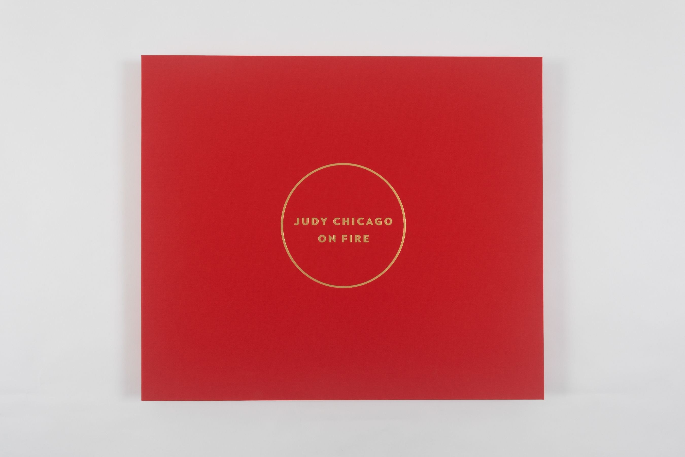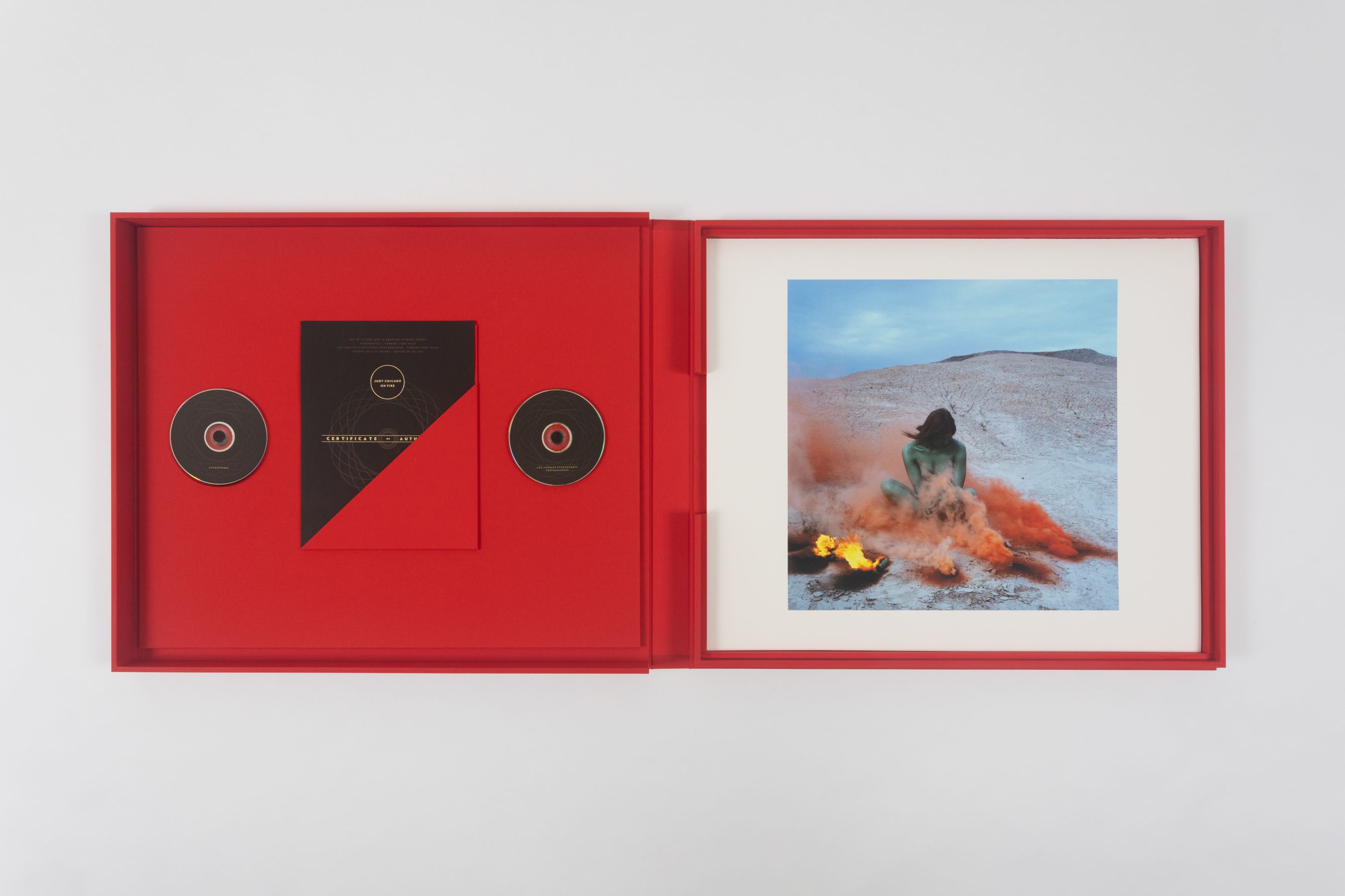
Judy ChicagoChicago in Ink
A virtual flat-file retrospective of legendary feminist artist.
Artwork
Click here to visit Chicago in Ink
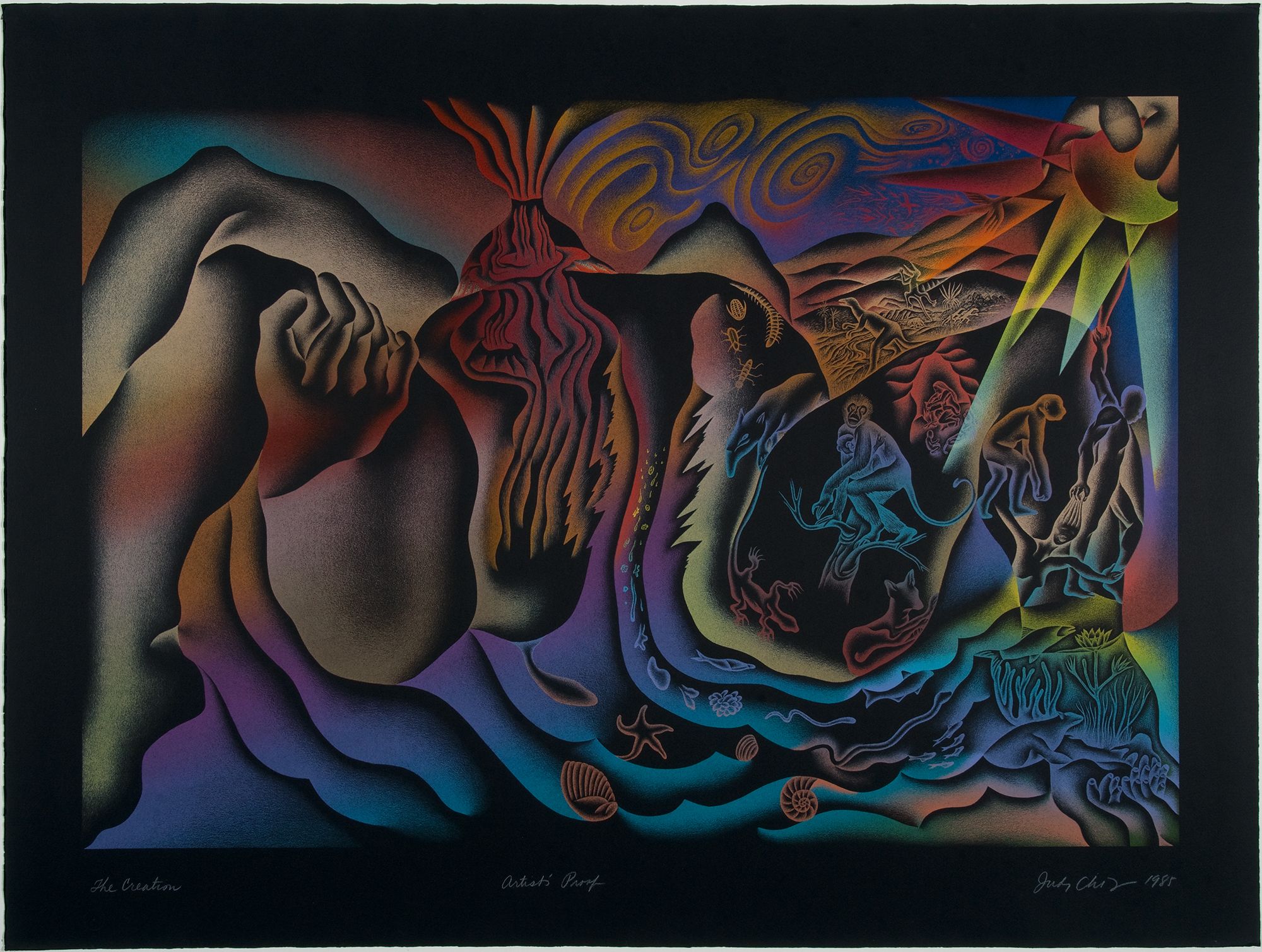
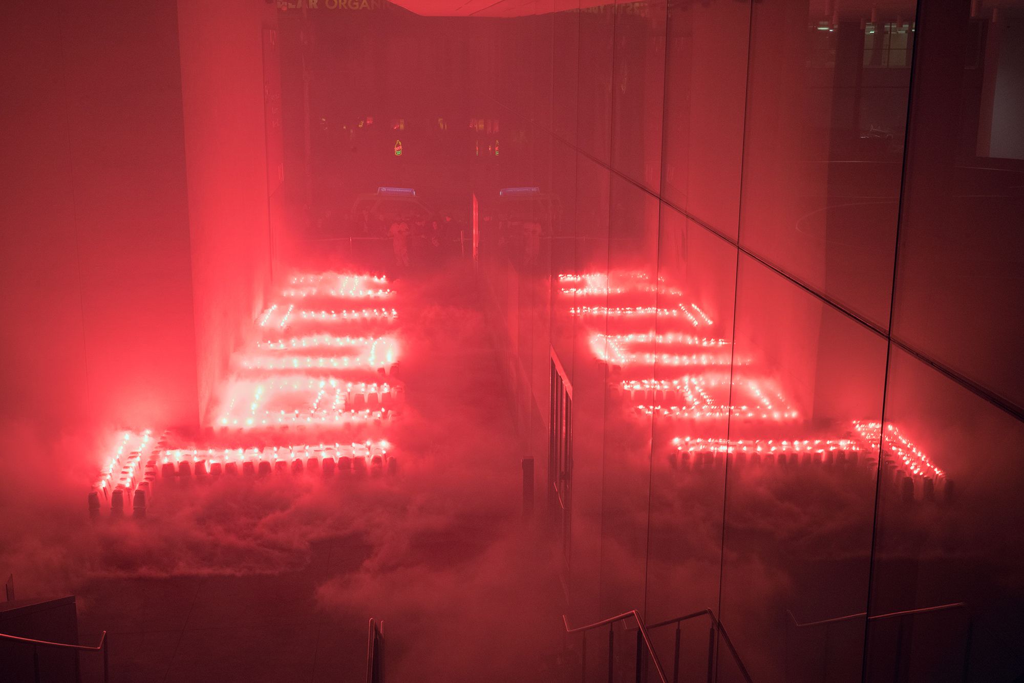
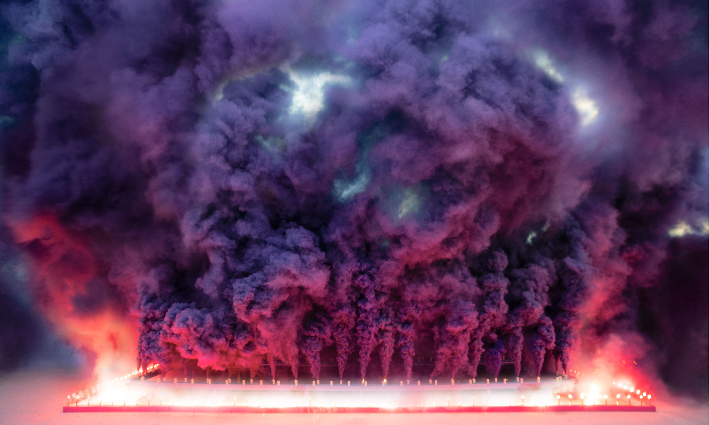
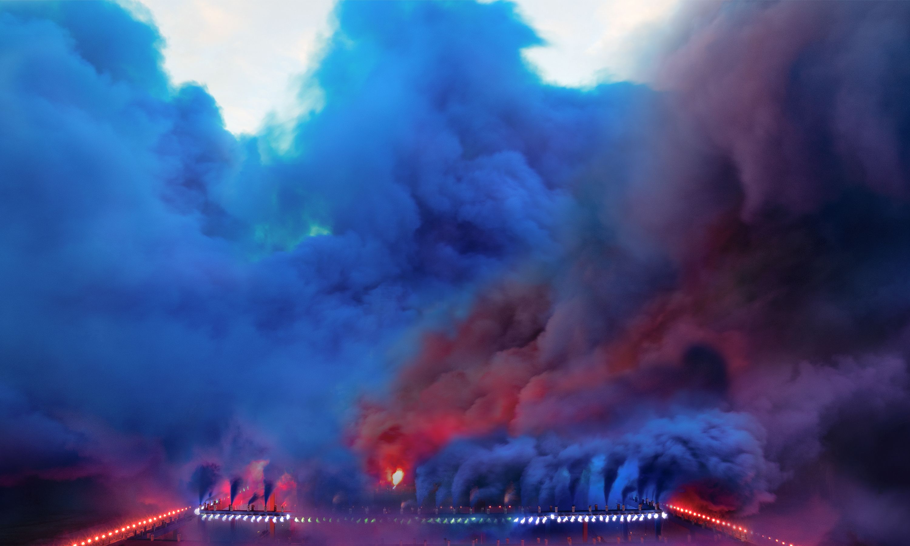
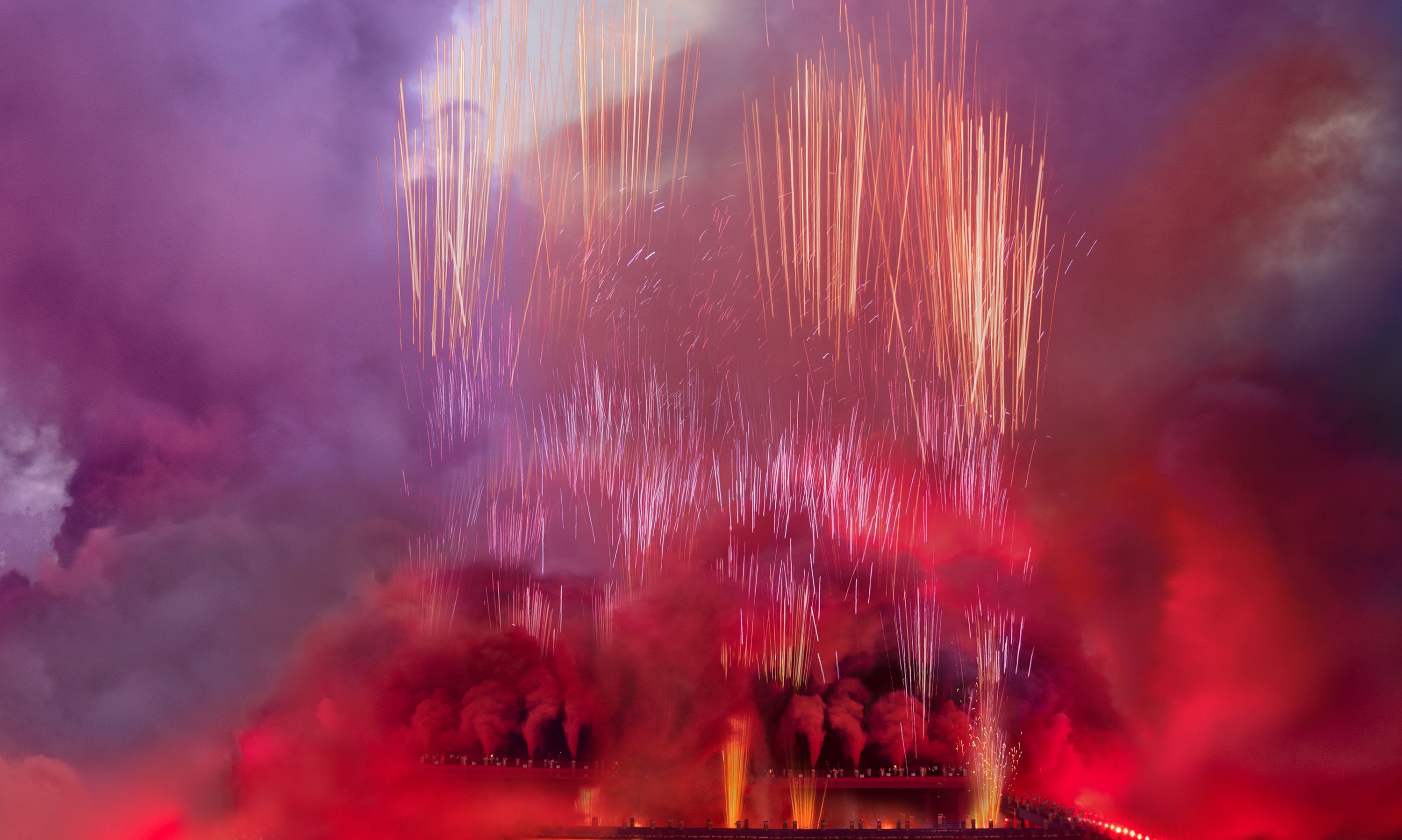
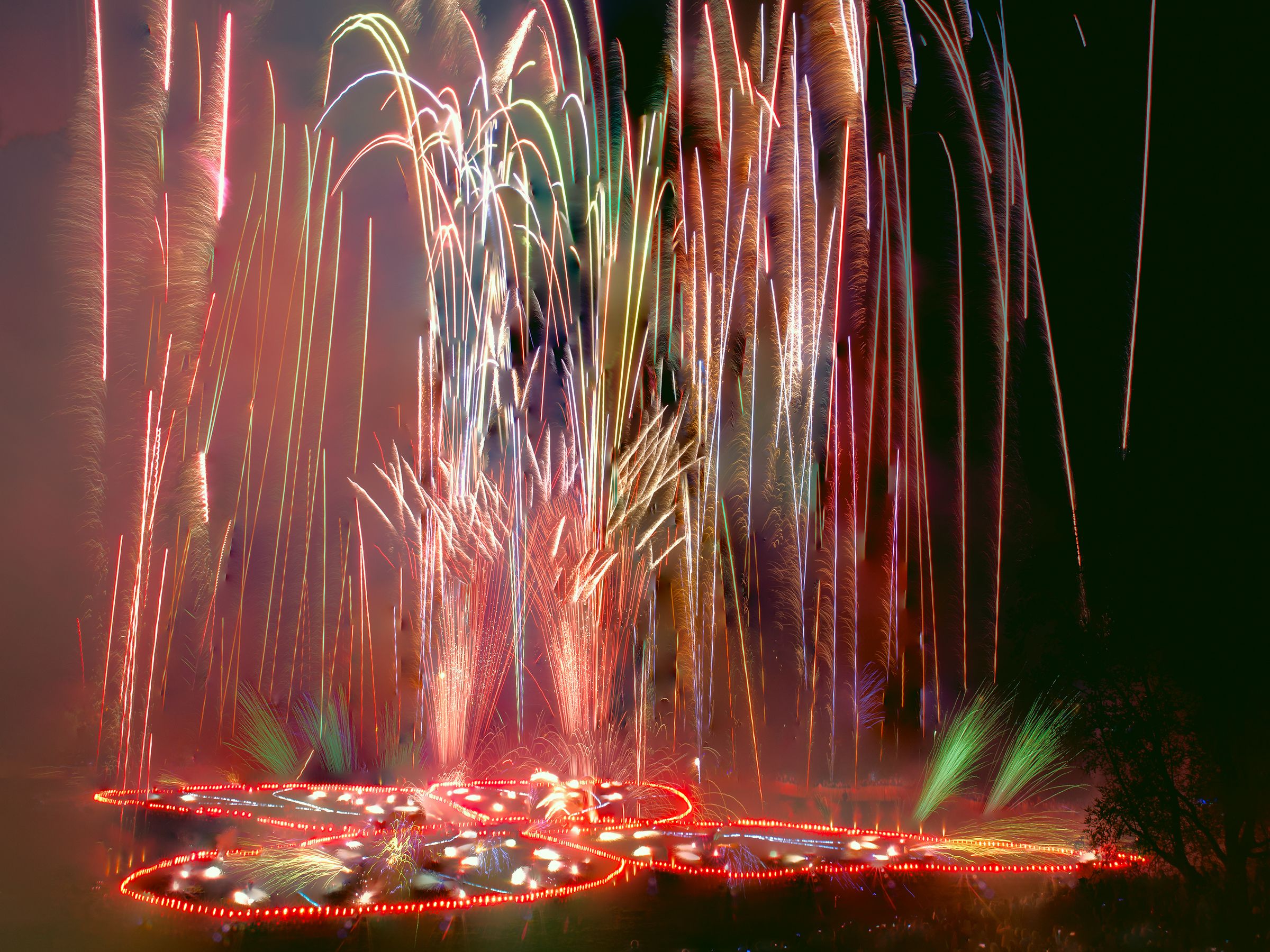
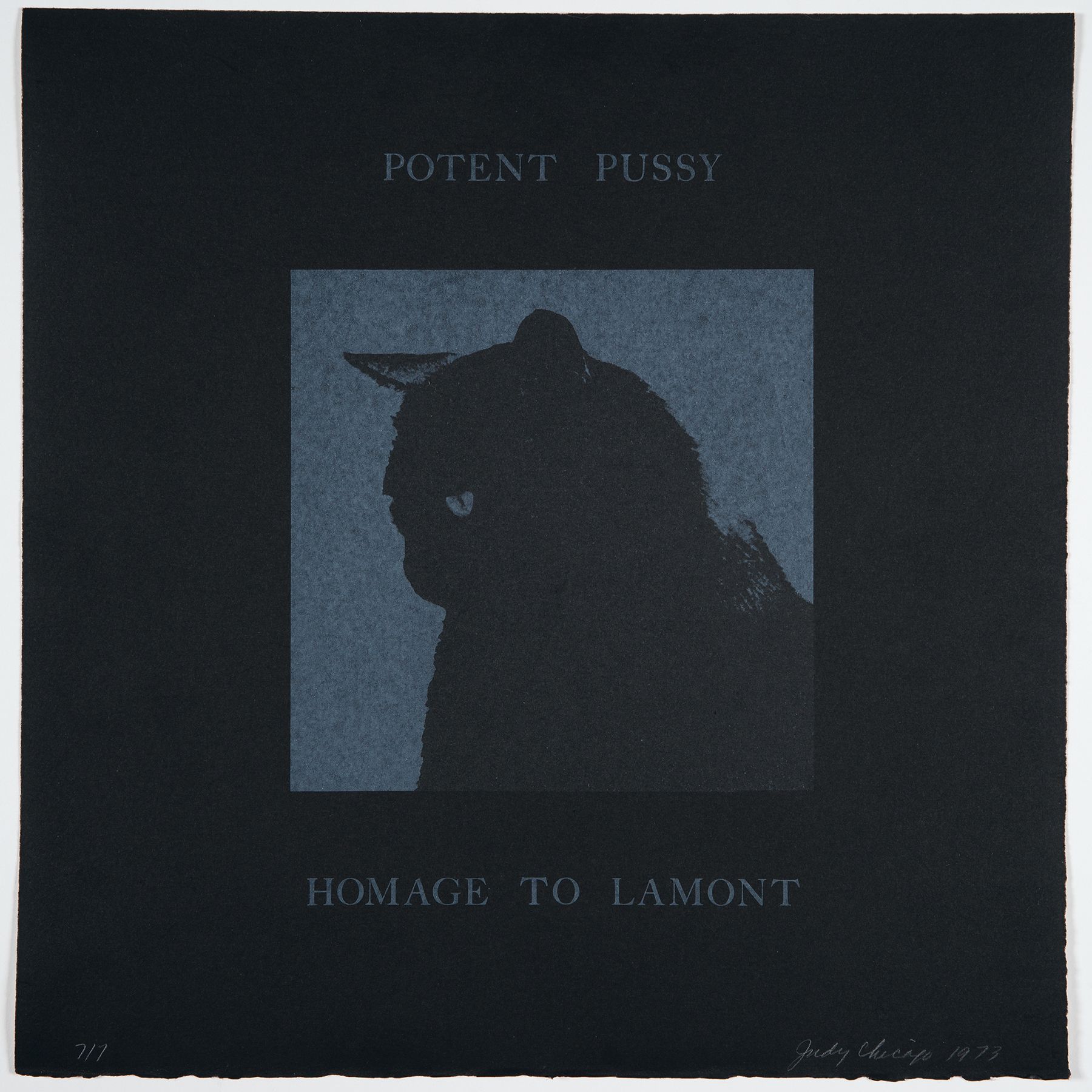
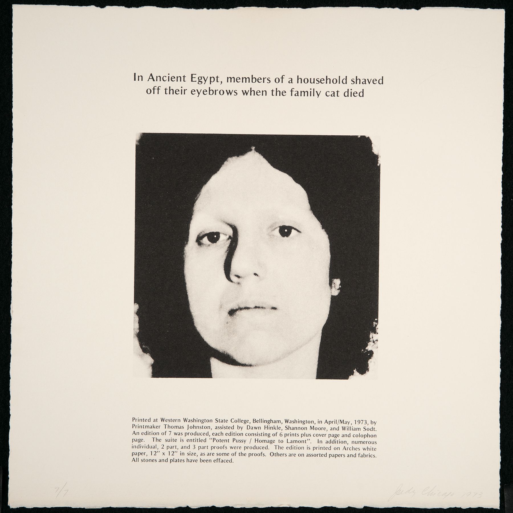
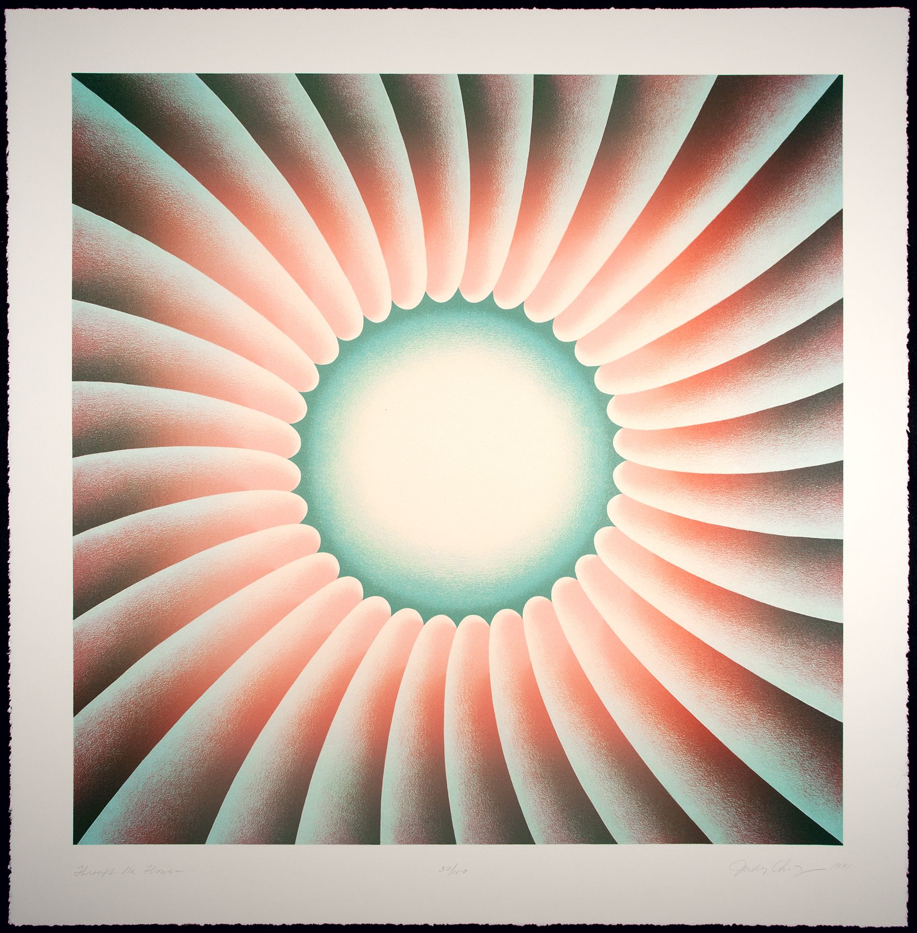
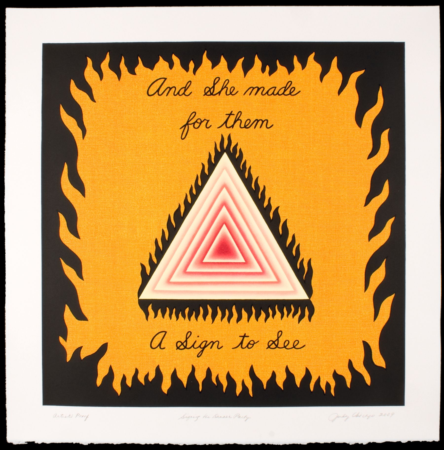
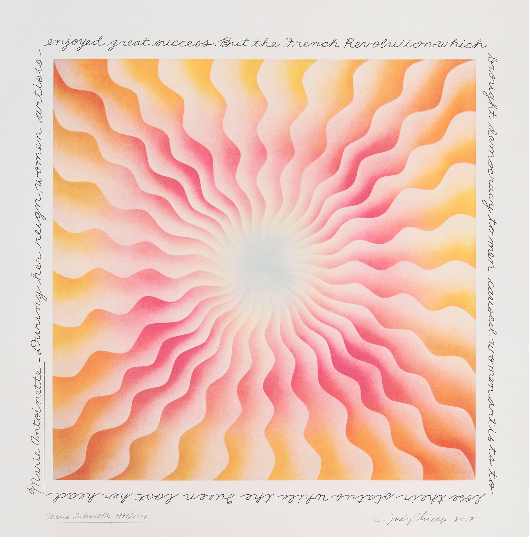
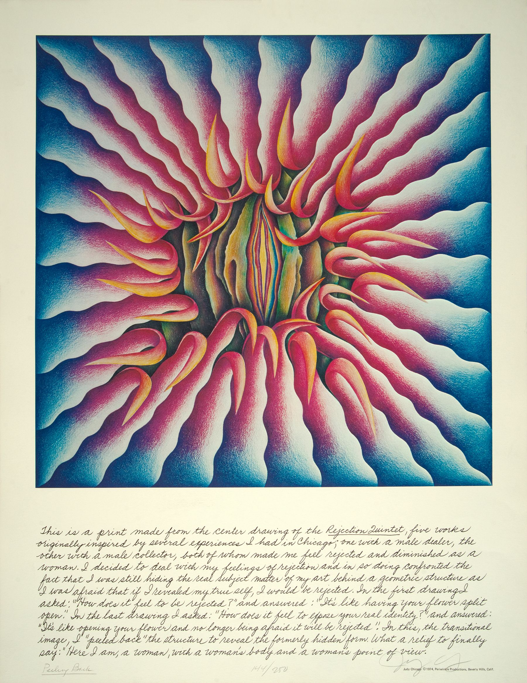
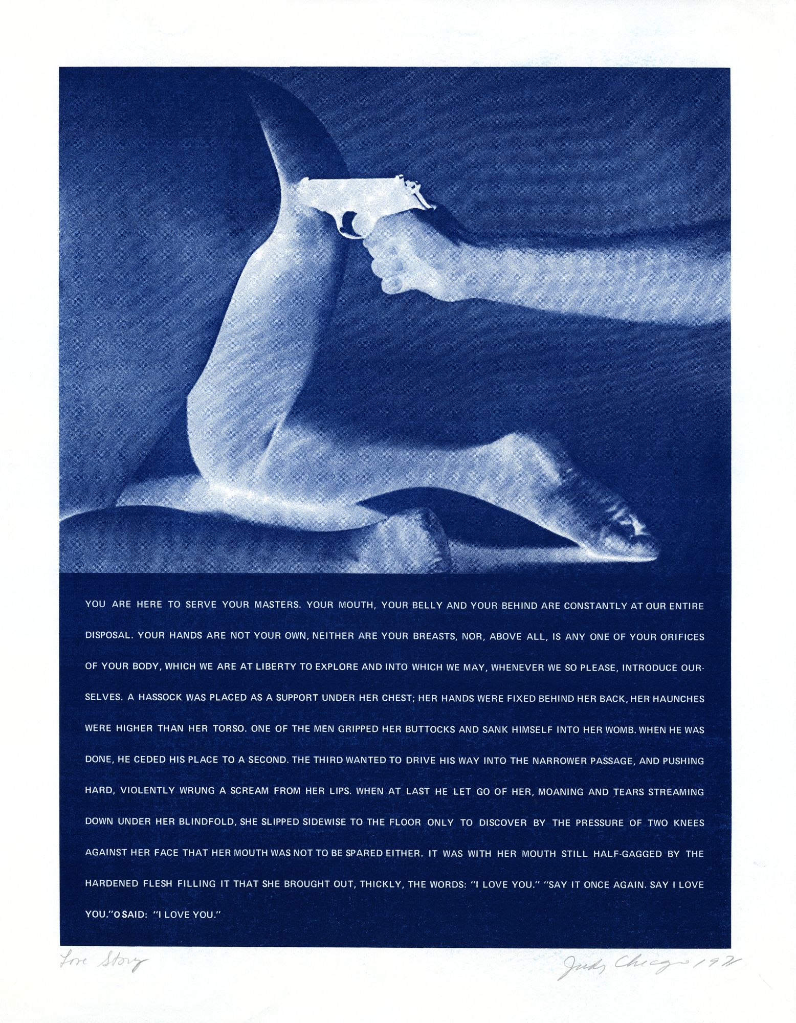
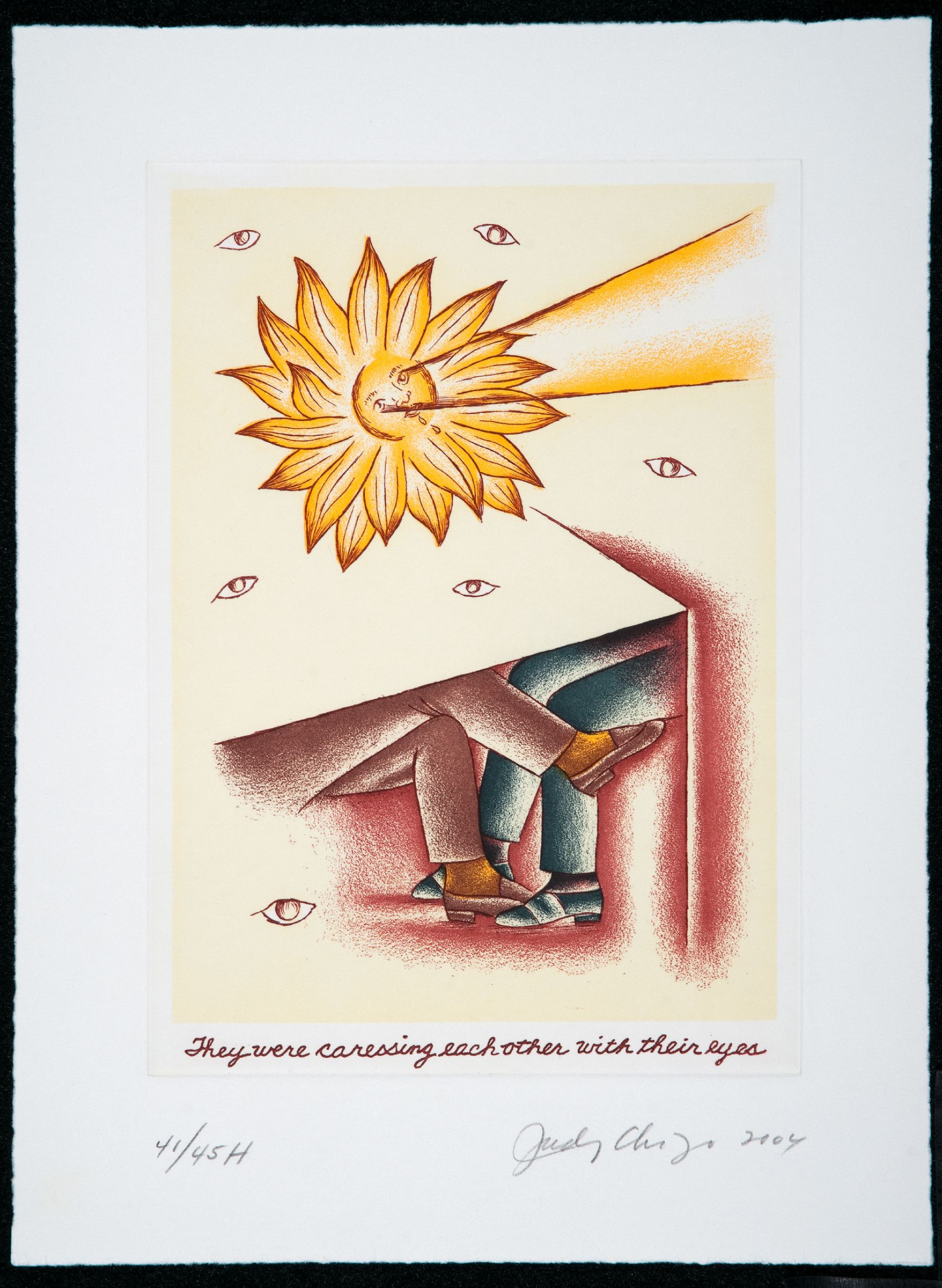
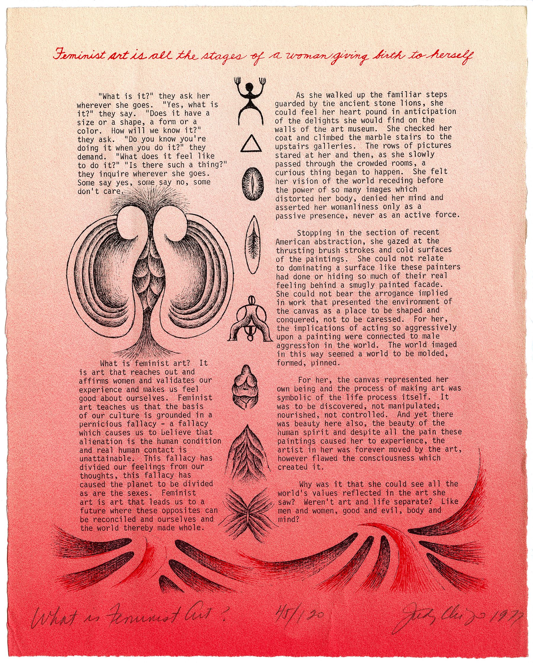
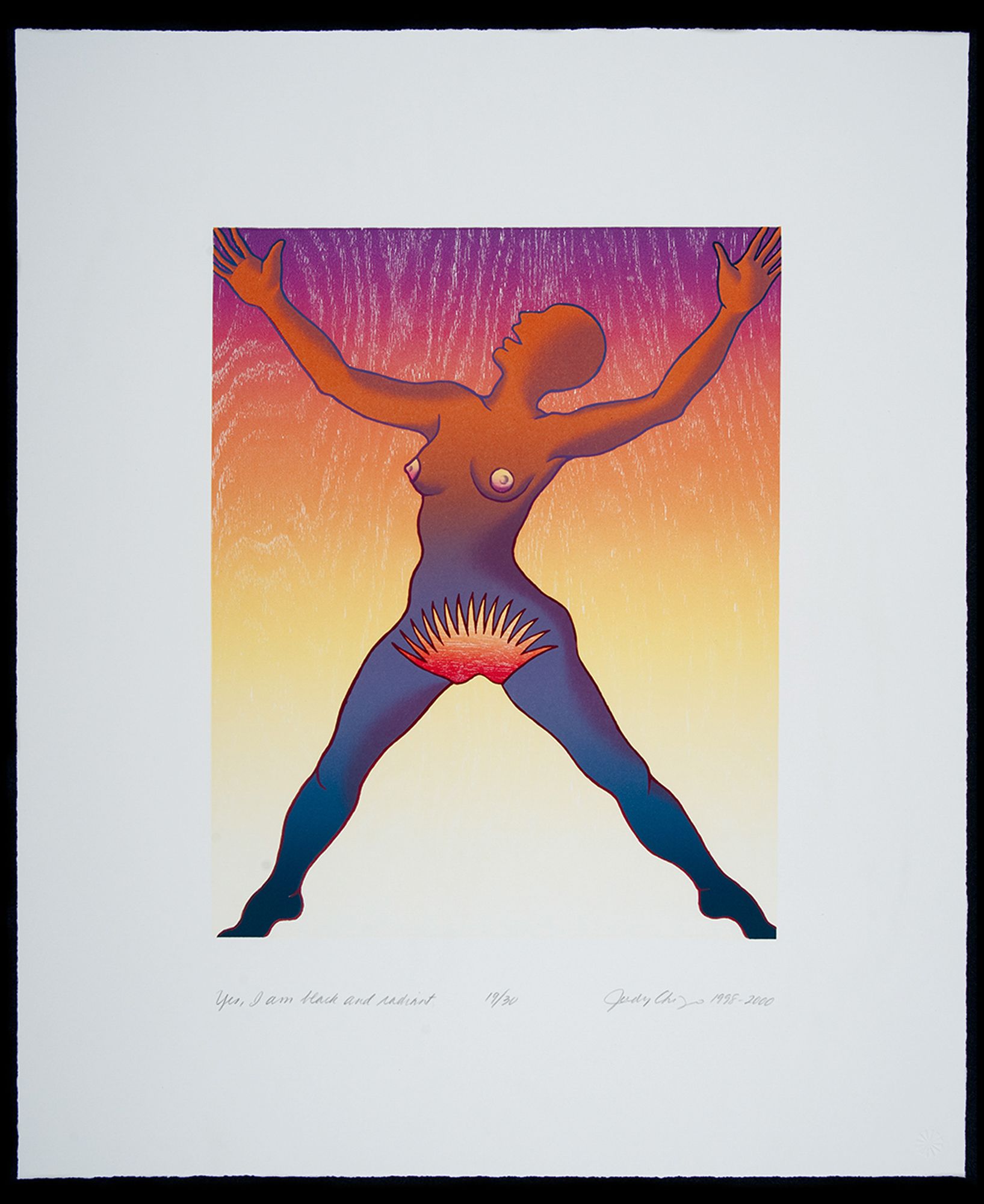
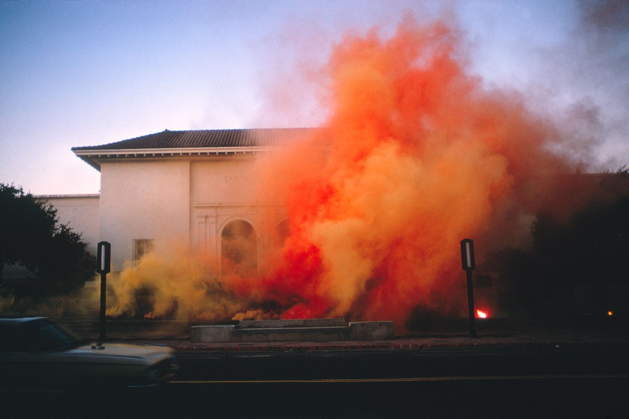
In a rare gesture for a contemporary artist, Judy Chicago has made prints with most of her bodies of work since 1965. Like much of the media she employs, printmaking is an inherently collaborative venture. Harnessing the respective expertise of master printers, Chicago fiercely experiments in various printing techniques. The multiplicity of prints and their collaborative production process expands the democratic accessibility of Chicago’s work. Over the past few years, we have re-engaged with Chicago’s political and inventive use of autobody airbrush painting, smoke and fireworks, needlework, sculpture and installation, china and glass painting, and so on. So, it is a great pleasure to invite equal attention to her prints and multiples, which advocate for the coextensive nature of feminist art and technical innovation. In these works, we can see the pioneering of new forms and visual languages and the consistency of her trademark notations, like flowers, rainbow ring motifs, butterflies, figures blended with landscapes, and unapologetically feminine colors.
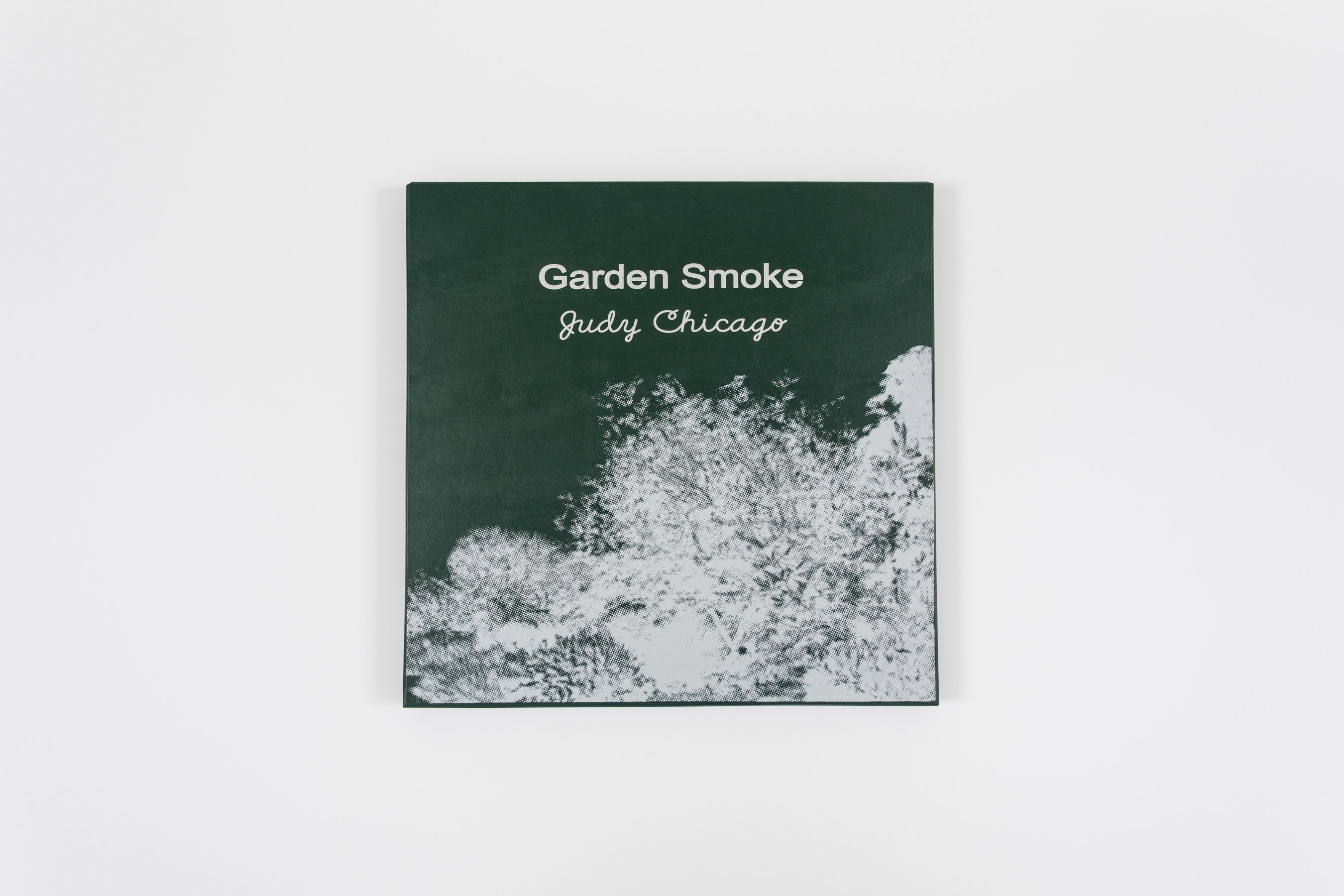
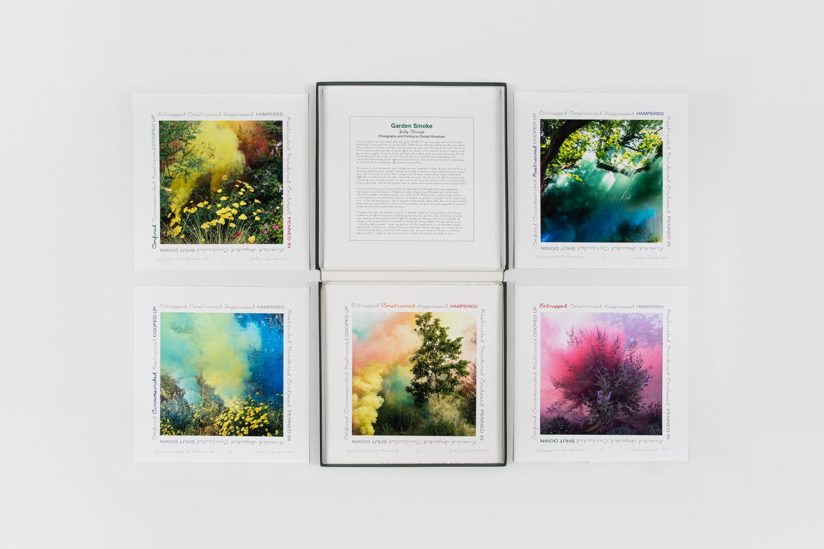
For Chicago in Ink: An Autobiography, Salon 94 presents an online exhibition prompted by the discovery of numerous unseen prints in Chicago’s archive. A virtual flat-file retrospective, the exhibition provides crucial insight into a number of Chicago’s groundbreaking series and into a medium that has always guided the legendary feminist artist. For this occasion, a new website (www.chicagoinink.com (http://www.chicagoinink.com/)) is devoted to Chicago’s prints, comprised of over 100 works produced in numerous techniques: serigraphy, aquatint, heliorelief and lithography with hand coloring, etching, intaglio and archival pigment and inkjet printing. The website also includes new films featuring Chicago discussing her print practice, interviews with the artist in the studio, rarely seen archival material, and shorts of her Atmospheres fireworks performances. In the spirit of Chicago’s transparent approach to artmaking, works will be available for direct purchase on the website, ranging in price from $4,500 to $100,000.
This exhibition is presented in tandem with the acquisition of Chicago’s extensive print archive by the Jordan Schnitzer Family Foundation, which joins four prestigious institutions that house portions of Chicago’s archives in an effort to make her work more accessible to scholars and to the general public:
- The Schlesinger Library on the History of Women in America, Radcliffe Institute for Advanced Study at Harvard University (Paper Archives)
- Penn State University Libraries (Art Education Archives)
- National Museum of Women in the Arts (Visual Archives)
- Center for Art + Environment Archive Collections at the Nevada Museum of Art (Colored Smoke, Dry Ice, and Fireworks Archive)
Chicago’s printmaking is central to her interdisciplinary, collaborative, labor-intensive, and rigorous body of work. In her prints, we can trace not only Chicago’s collaborative methodology and a resistance to patriarchal creation myths, but also her extremely complex formal and technical experimentation with master techniques and art historical narratives. For example, in her Voices from the Song of Songs (1998) from her Jewish Themes series created at Graphicstudio at the University of South Florida, Chicago combined hand-coloring with lithography and heliorelief—a technique in which photographic images are transferred to woodblock prints by sandblasting. The meticulous use of the woodblock print produces beautiful gradations within the strong, graphic lines of the text and images. Alongside these new techniques, Chicago insisted on procuring a Hebrew typeface to mirror the English one, giving equal weight to the Bible’s mother tongue. Chicago also used a contemporary translation of the Biblical Song of Songs that emphasizes the female voice, her desire, and the mutuality of lust. Synonymous with the goals of feminism and feminist art, Chicago’s prints combine the new with the historical, and rigor with pleasure.
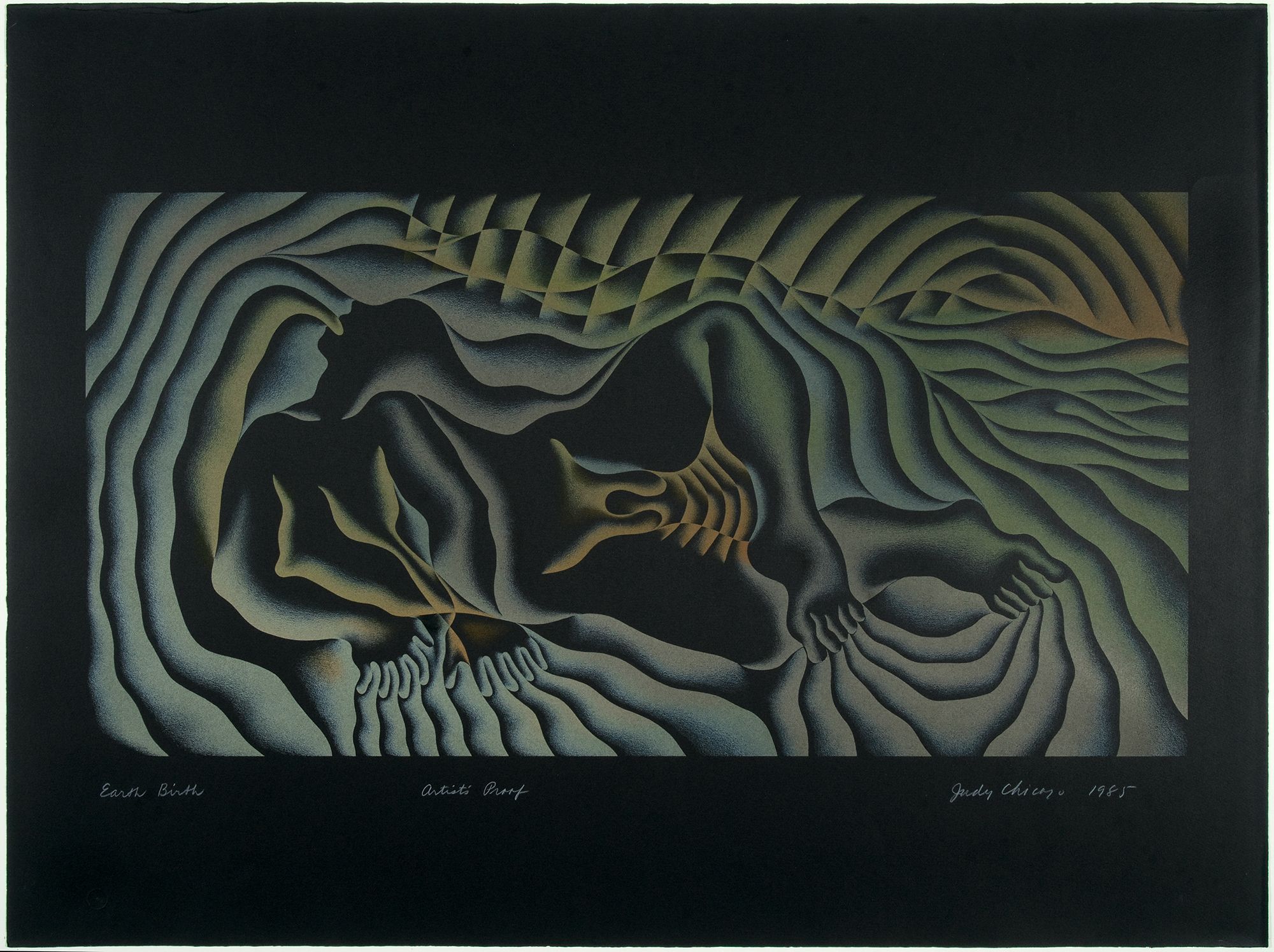
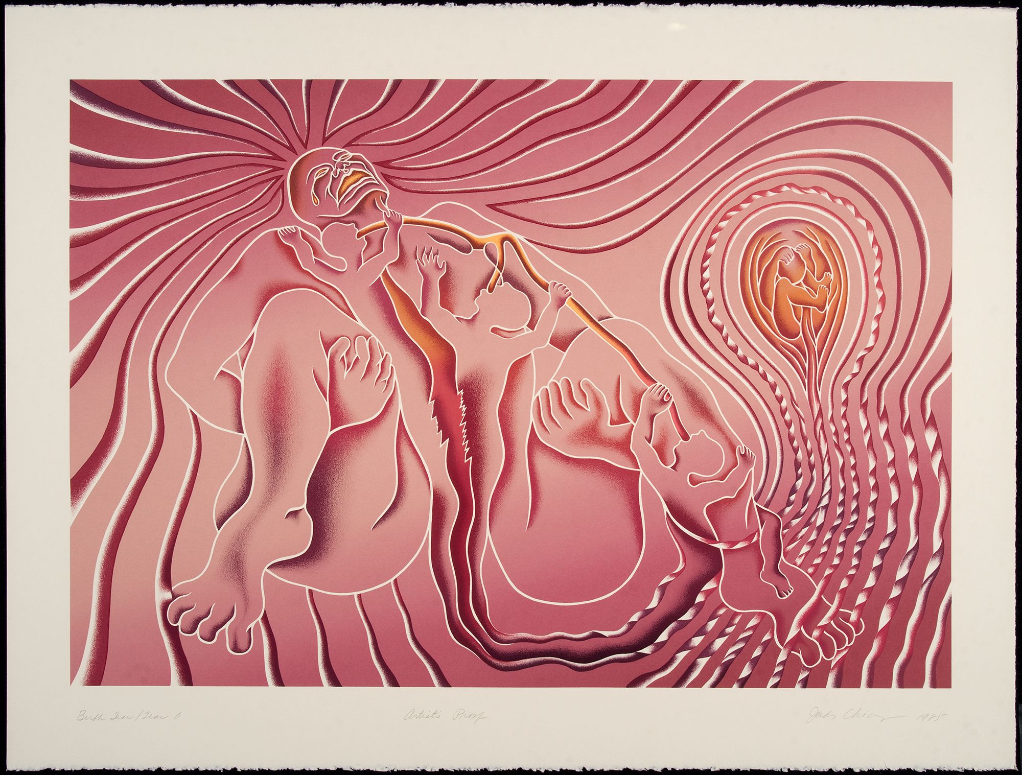
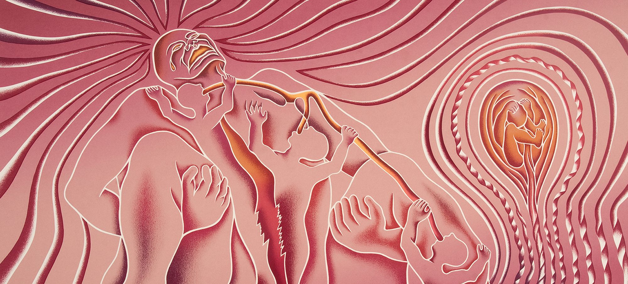
In this retrospective on paper, we can see Chicago’s creation of new forms and visual languages, as well as the consistency and subtle manipulations of her iconic notations, such as her color palette formed of her signature violets, soft pinks, fiery yellows, earth tones, and black. Developed during her explorations of color theory in the 1960s, she created her own color system that could communicate emotive states that she continues to use in her artwork today. The Getty Research Institute owns Chicago’s color system book from this early period. Chicago embraced unapologetic colors as an orgasmic, anti-rational response to the rigidity of Josef Albers’s color theory. While Albers in his famous Homage to the Square series (1951-1976) laid down oil paint solidly and directly from the tube, Chicago is more prone to oscillating between saturated and modulated colors, depending on the emotional effect she wants to achieve. She also often utilized black, most notably in the Birth Project(1980-1985) and The End: A Meditation on Death and Extinction (2015), not only because of the complexity of using colors with and on top of black, but also to foreground the primal experience of darkness as both an origin and the ultimate conclusion.
Chicago’s graphic impulse and an interest in the emotive potential of color, printmaking offers a degree of control otherwise not afforded by needlework and other techniques. From that control, she generates chromatic waves of energy, rhythms of line that echo the lines of the body, and vibrating whispers or screams ranging from pain to joy. Seeing these prints together enables us to locate Chicago in a history and track her visual style while simultaneously locating historical styles like Finish Fetish, the Bauhaus, post-minimalism, text-based conceptualism, and Expressionism.
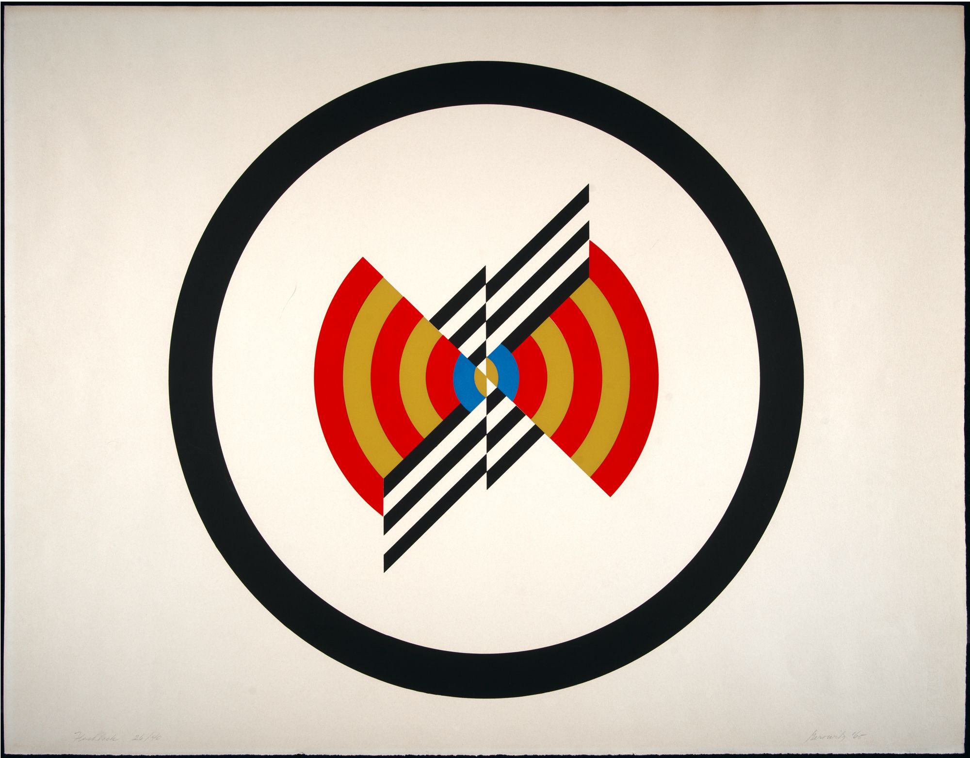
Chicago in Ink: An Autobiography spans the majority of that history. Included is a rare print called Flashback, version 2 from 1965—so early that it is signed “Gerowitz,” Chicago’s surname before she, in a feminist gesture to subvert tradition, chose her own name in 1970. Flashback, Version 2 is a print that appears to be minimal but already suggests the central core imagery and color that would come to be associated with the more recognizably feminist imagery that she pioneered in the 1970s.
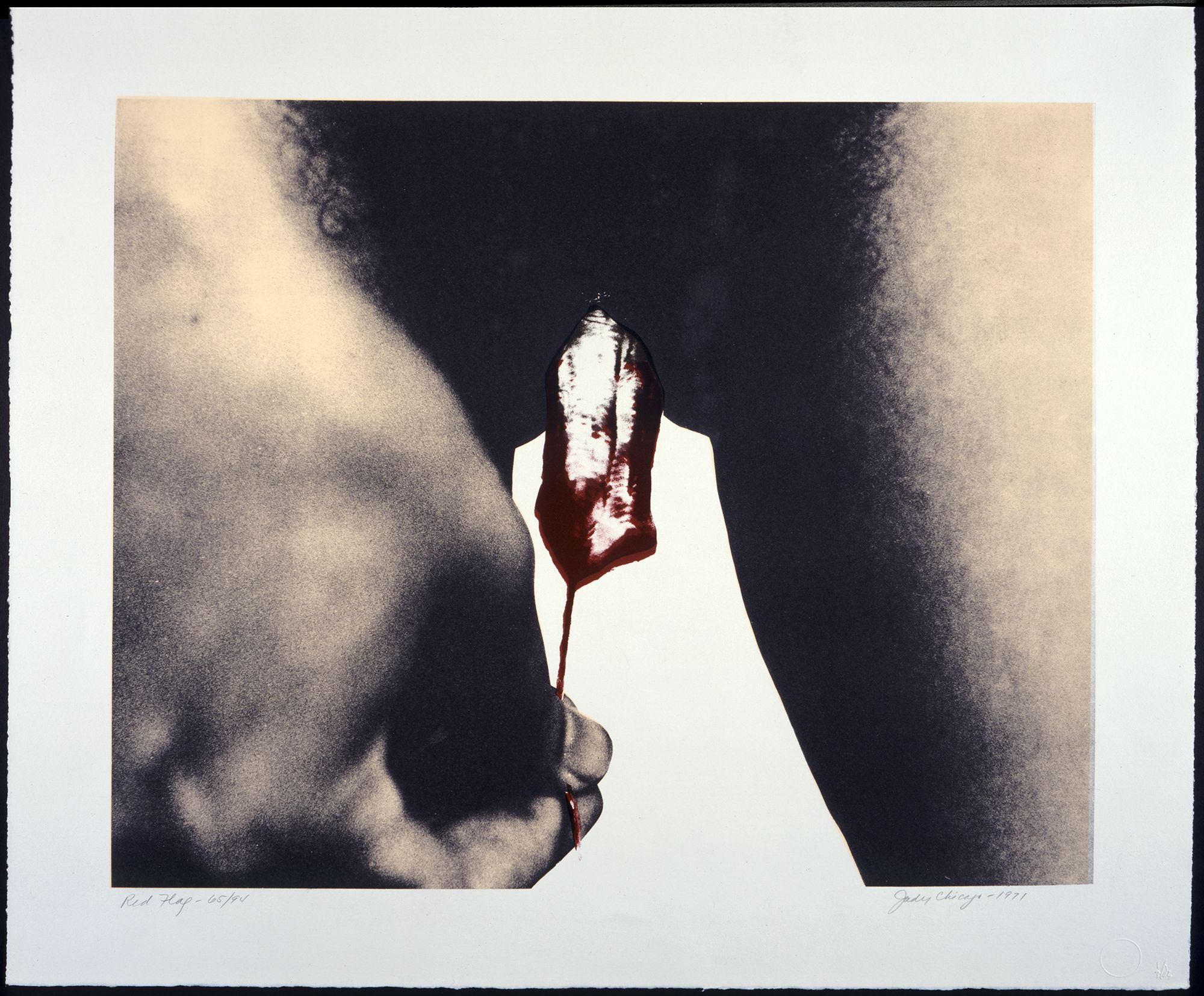
In the 1960s and into the 1970s, print studios in Southern California were invariably owned by men, and Chicago’s printmaking became a way for her to claim these spaces and their techniques for women. In her autobiography, Chicago recalls creating Red Flag (1971), regarded as the first image of menstruation in contemporary art, “I was very nervous when I brought the photograph to [Sam Francis’s] litho shop, where I would work with a male printer… I made the print for two reasons: first, I wanted to validate female subject matter by using a ‘high art’ process of hand lithography and second, I was trying to test male reaction to overt female subject matter.” The thought of Chicago showing up to a print studio with a photograph of a bloody tampon remains bold and disruptive.
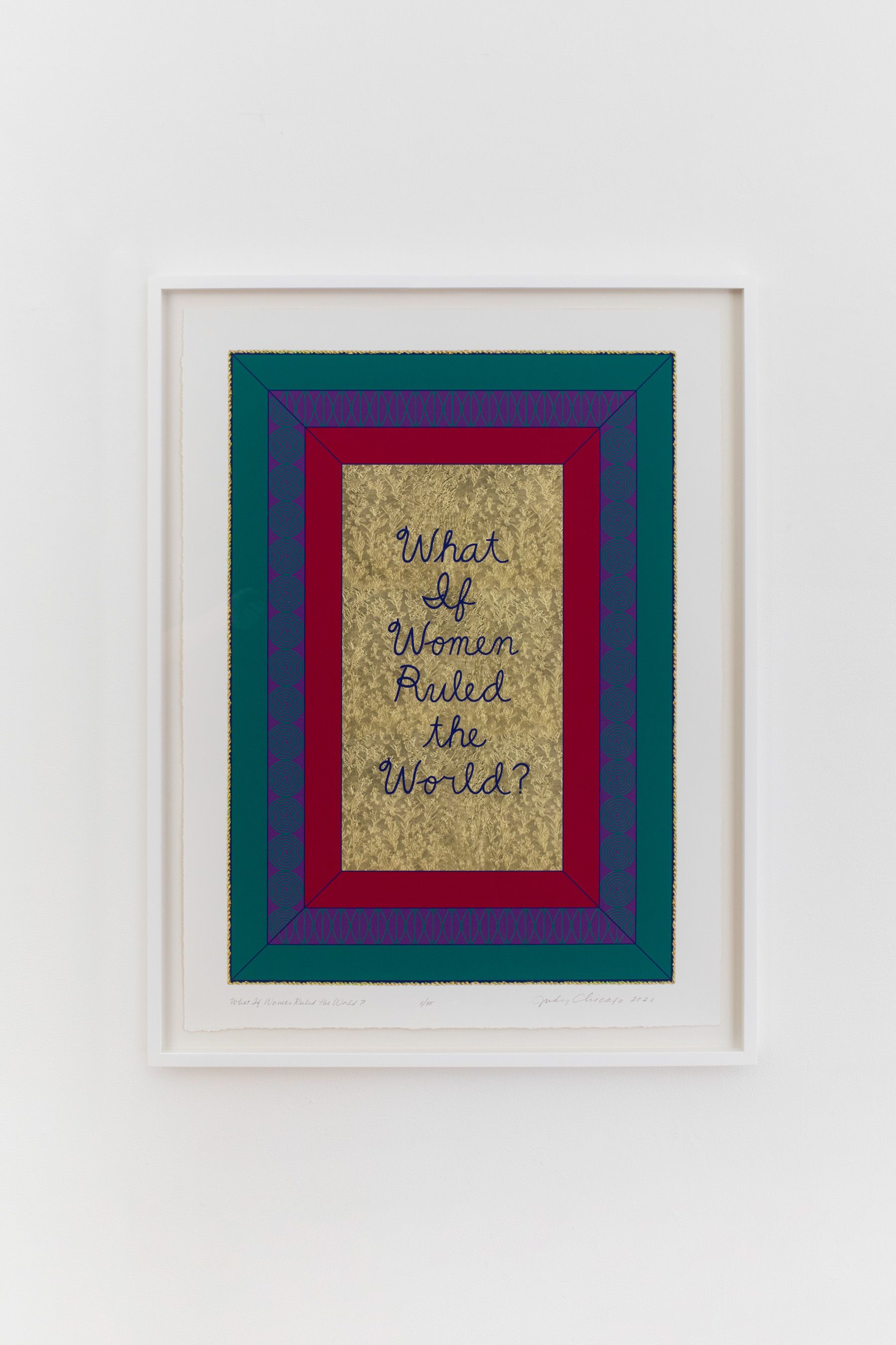
Early works like Flashback, Version 2 and Red Flag vibrate through and connect with more recent prints, like In Praise of Prairie Dogs (2019), which positions feminism within a politics of ecological harmony that encompasses the eroticism between non-human creatures as well. Chicago’s newest print in the exhibition, What if Women Ruled the World? Commemorative Print, was created as part of The Female Divine, a collaboration between Chicago and Dior that inspired the Spring/Summer 2020 haute couture collection. The first 25 prints in the edition are available exclusively on the site for $4,500. Judy Chicago, ever shifting, adapting, collaborating, and exploring new media, has nevertheless remained steadfast in her core values and vision for over 50 years. Her prints are a driving force of that legacy and indicate the evolution of an inimitable formal language that is both meticulous and brazen.
